The Shed Roof - SLA's version of the Linear Shed Roof

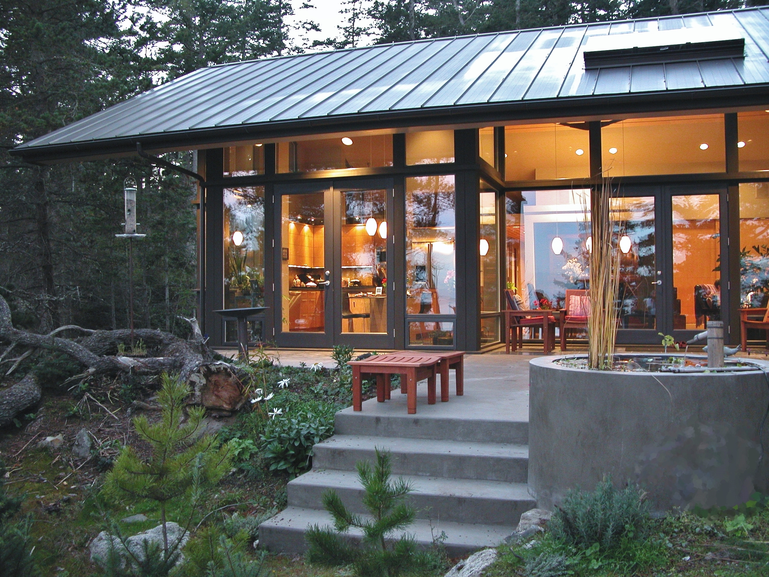
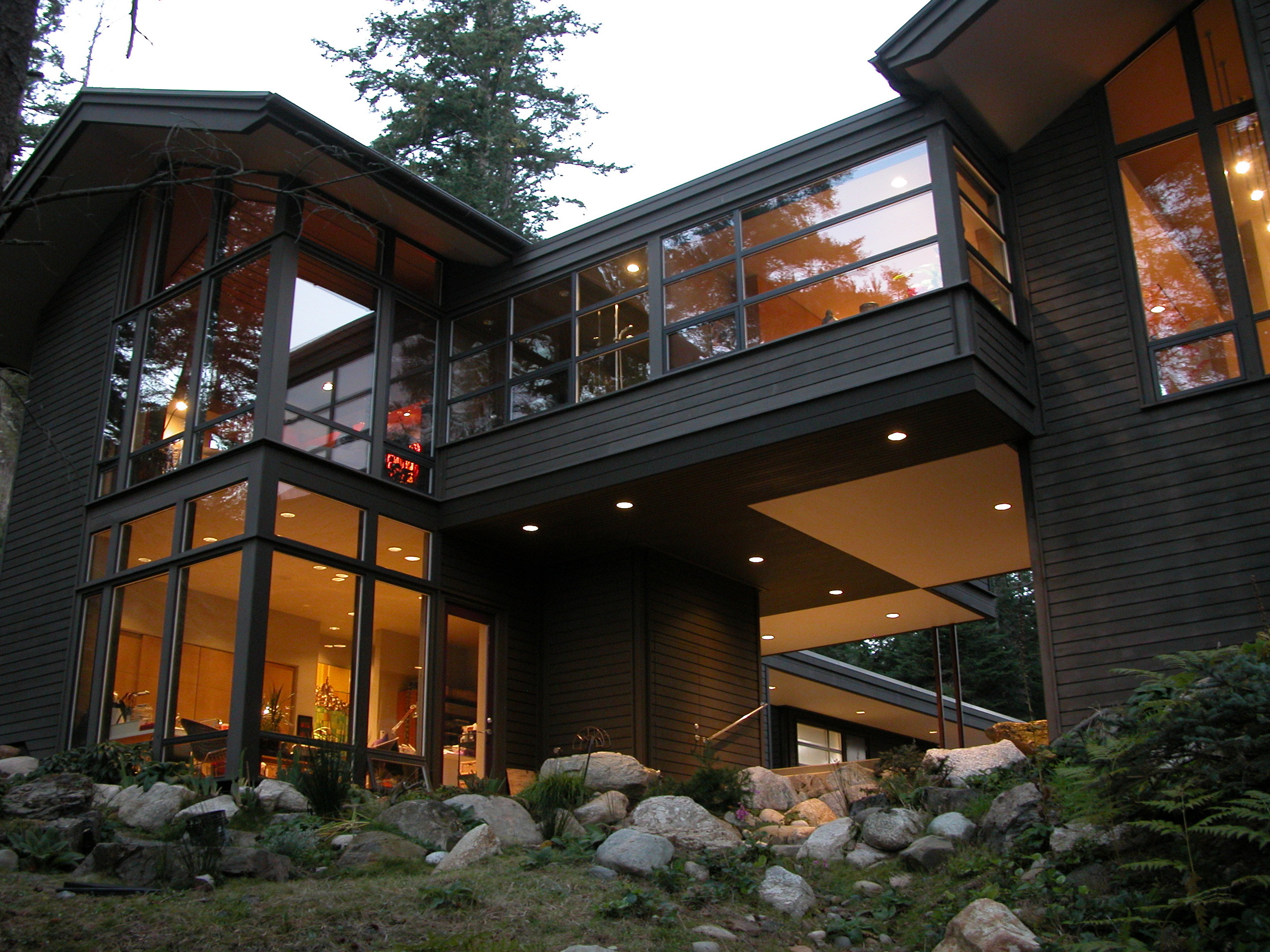
Linear shed roof for Vashon Island home

Linear shed roof for Vashon Island home

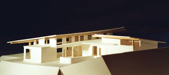
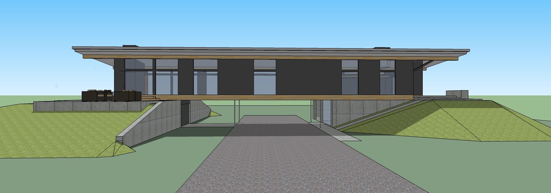
Over the last decade we have had the challenge to design modern yet modest, cost-effective homes for our clients.  This led us to explore in more detail the various shapes and construction techniques to reduce cost and at the same time retain design delight and a Pacific Northwest modern style.  What came of that research was a linear shed roof typology.
Some examples of this construction method is shown in the following images.

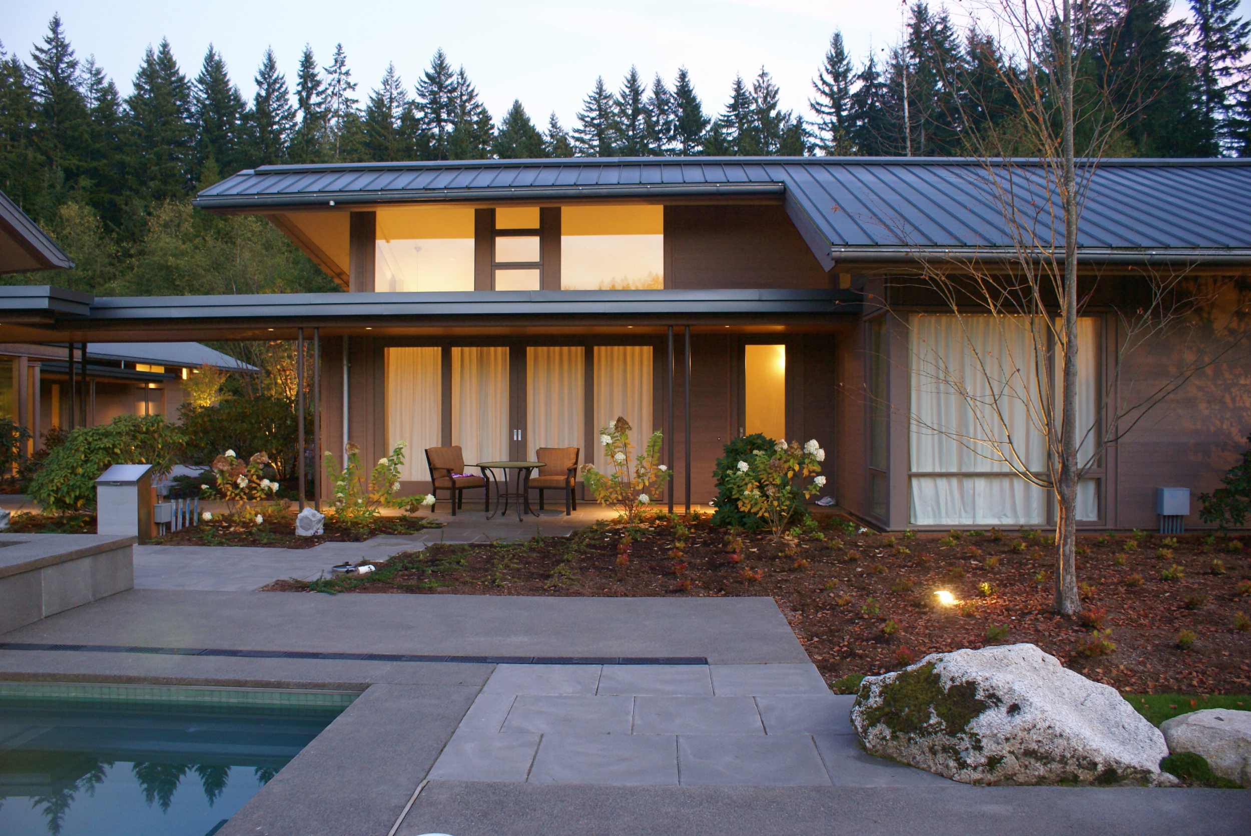
Combination of linear sheds to form a courtyard

Combination of linear sheds to form a courtyard

Linear shed roof on house and adjacent garage

Linear shed roof on house and adjacent garage

SLA image
Beams supporting standard rafter framing

Beams supporting standard rafter framing

Refined over several iterations, it was most recently used on our Anacortes Project .  We stick to standard carpentry and a simple framing layouts to keep it cost effective while still providing a modern element. The roof needed to work with standard insulation and roofing materials, but at the same time have some delight and that PNW feel.

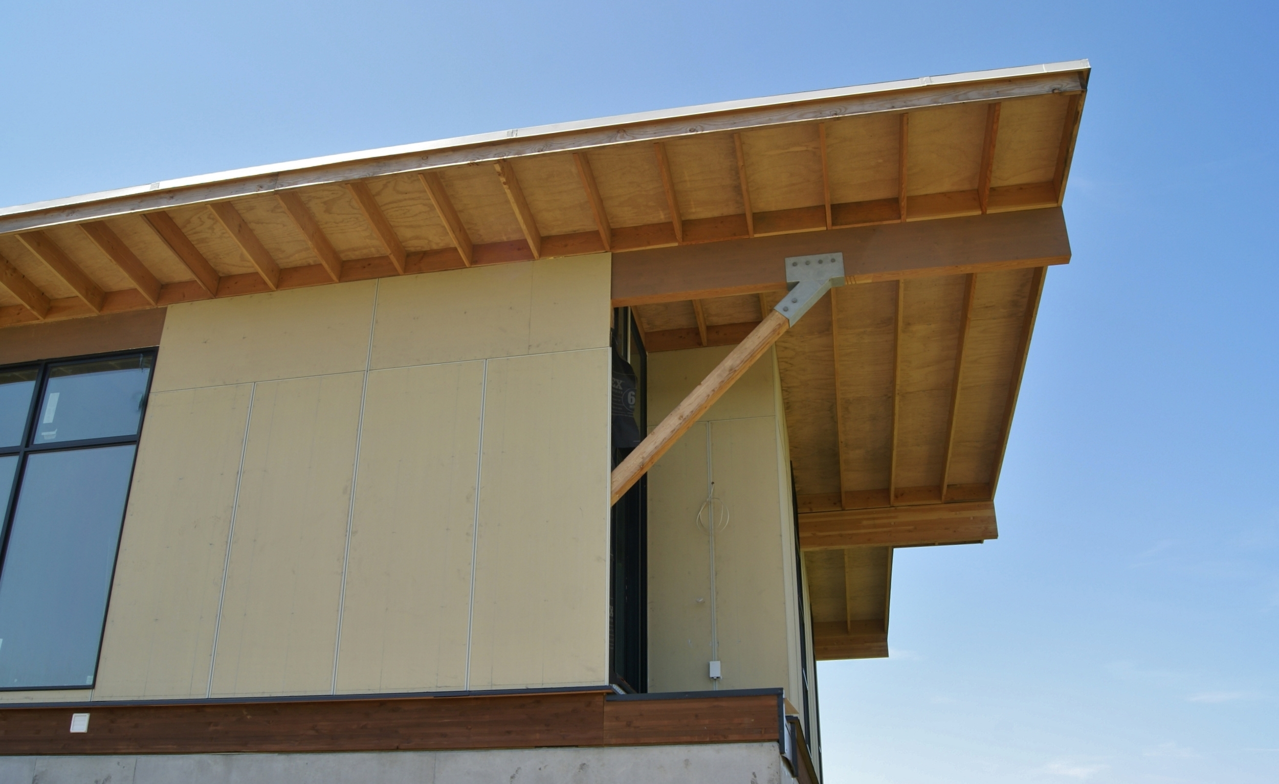
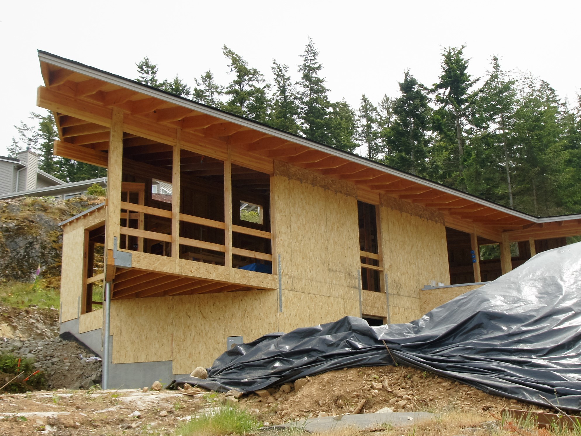
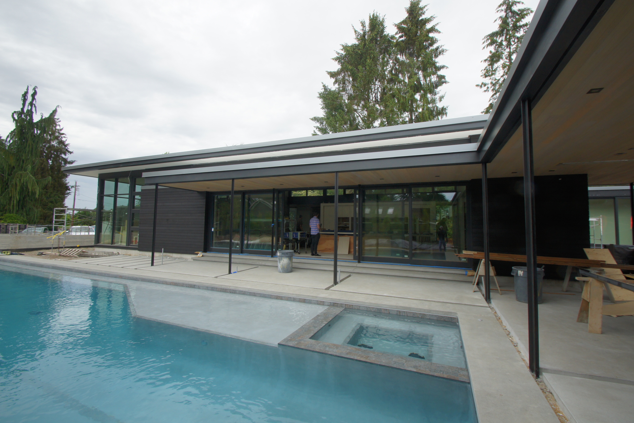
By laying out the homes in a linear fashion, we could bring in more light to the individual rooms.  The floor and roof framing are simple single span affairs with repeated layout.  Setting glulam beams along the parallel walls allowed for an expression of the structure and carried out the overhangs we needed.  We are able to single span the building with standard framing, then roof and insulate.  With a shallow pitch we could use standard shingles.  The higher sidewall allowed for accessory building spaces to be attached and still have light penetrating.  The high side of the roof opened up to capture uphill light for the home, while the low side frames the views.

Shed Roof set on Glulam Beams

Shed Roof set on Glulam Beams

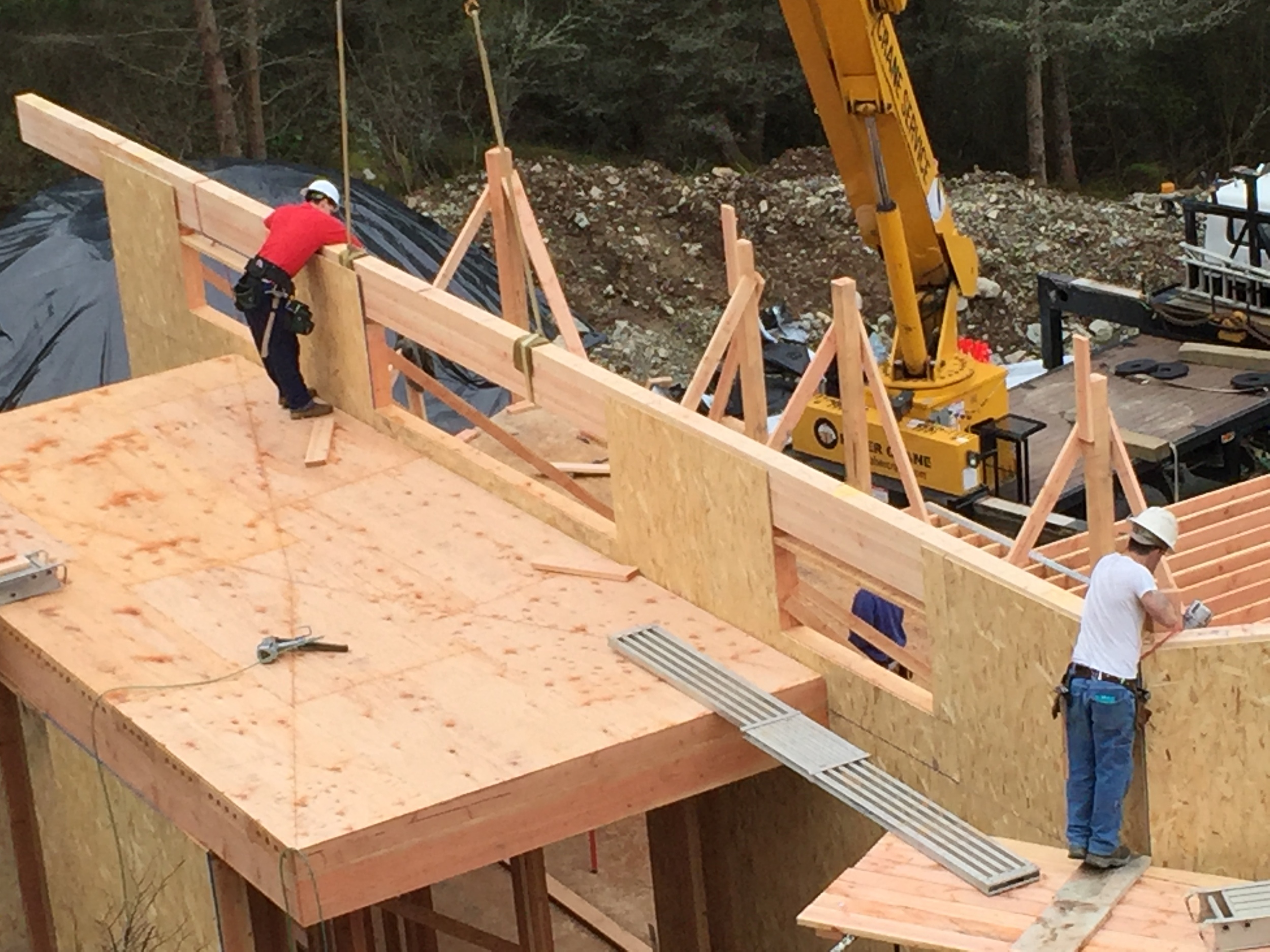
Beams are set on top of the walls, sheathing keeps the beams in place.

Beams are set on top of the walls, sheathing keeps the beams in place.

Upper windows bring in light.
The simple roof still conveys a nice sense of drama with its overhangs.

The simple roof still conveys a nice sense of drama with its overhangs.

Taller walls allow for more light to enter the building on the uphill side

Taller walls allow for more light to enter the building on the uphill side

In the end, the modest budget buildings of the last decade have created for us and our clients an aesthetic that we have used successfully to produce dynamic, modern homes at a modest cost.
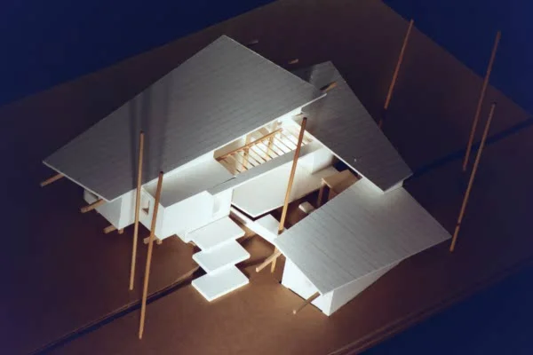
Accessory Dwelling Unit for a North Seattle Lot

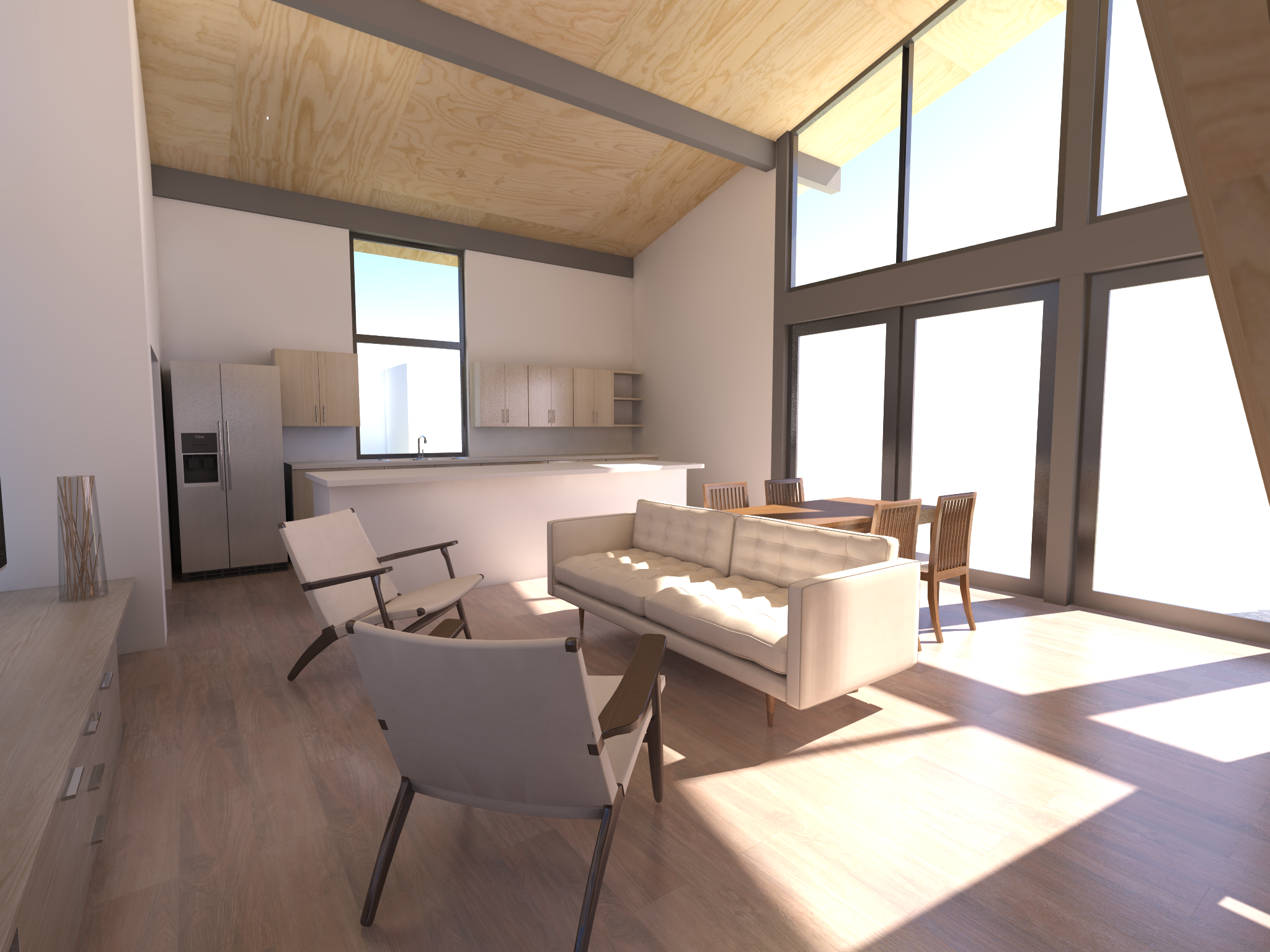
A view from the kitchen of the ADU.

A view from the kitchen of the ADU.

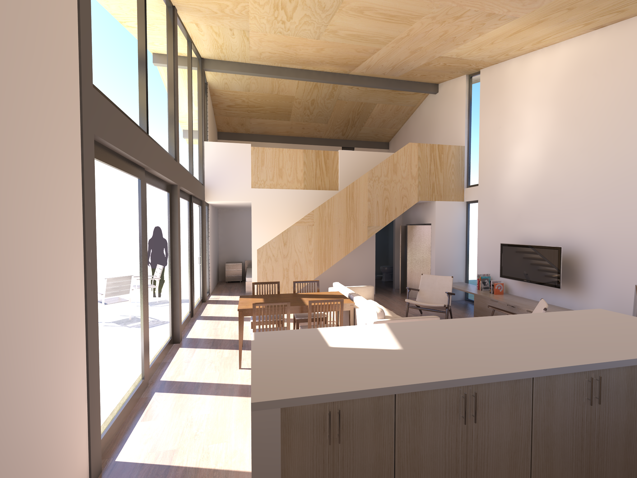
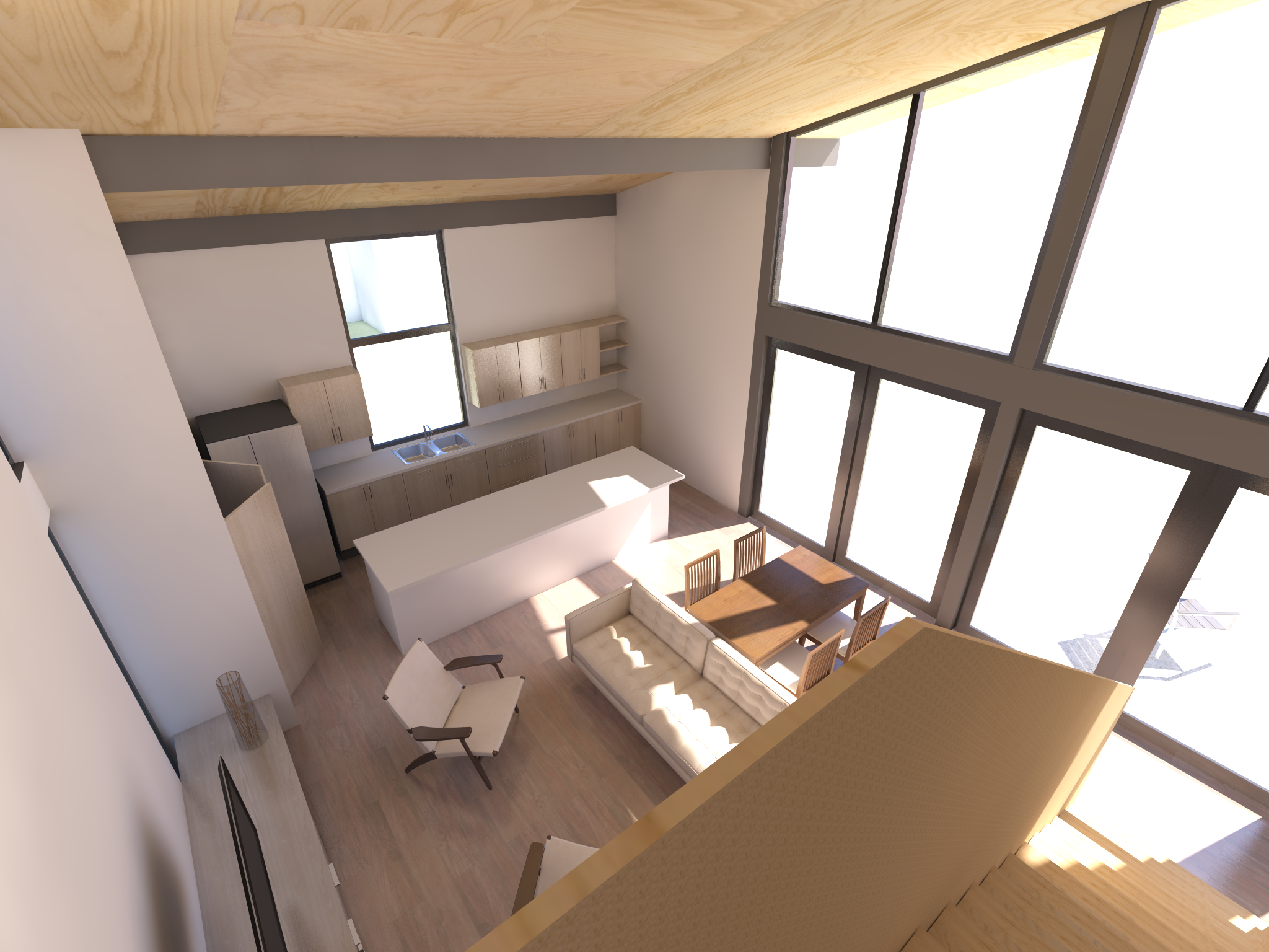
Shown here is an accessory dwelling unit for a lot in north Seattle.  In repurposing an existing back yard garage slab, we are able to reduce construction cost.  An open and airy living space is organized around a large and tall east facing window which opens out onto the lawn.  The result is an airy, open and delightful Accessory Dwelling Unit.

A view of the sitting area and dining.

A view of the sitting area and dining.

SLA image
view from the stair to the living area

view from the stair to the living area

view from the stair.  The stair is to be laminated marine plywood construction.

view from the stair.  The stair is to be laminated marine plywood construction.

New Tile Patterns and Sizes!

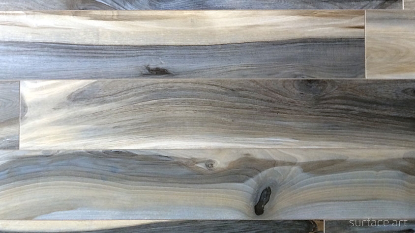
We have been looking for new tile selections for various projects.  These from Surface Art in Seattle and Pental caught our eye.  The tile manufacturers are creating some wonderful new products.  The patterns are great, the colors are sophisticated and they come in very large format. 

Seattle Surface Art tile: New Zealand Plank.  We will try using this for our entry hall at the North Idaho cabin project.

Seattle Surface Art tile: New Zealand Plank.  We will try using this for our entry hall at the North Idaho cabin project.

This Surface Art tile, Sediments will be used at our Anacortes project.  It will look great!

This Surface Art tile, Sediments will be used at our Anacortes project.  It will look great!

A darker version of the Sediments tile.  This one is great.  We are surrounding a fireplace with this tile. 

A darker version of the Sediments tile.  This one is great.  We are surrounding a fireplace with this tile. 

Some, like the WOW tile from Pental are show stoppers.  We are excited to be using these in our projects.

This is a wonderful Pental accent tile called WOW.  No location yet on a project but we are excited for the possibilities.

This is a wonderful Pental accent tile called WOW.  No location yet on a project but we are excited for the possibilities.

We will post photos of the finished installations when they are done!

Some Beautifully Proportioned Homes

My wife and I ran across some beautifully proportioned homes in Missoula, Montana recently.  They were such a pleasure to see and made our walk more rewarding.  The architects and builders of these homes spent extra effort making sure everything looked just right.  Proportioning the walls to the windows to the doors to the roof is a process of refinement.  And these were well refined!

The current owners have kept them looking beautiful.  Their landscaping sets them off beautifully.

WP_20160605_014 (2).jpg

It is a delight to see some of these wonderful places when out for a walk.  Here is hoping for great architecture everywhere!

Exterior Color Selection

Building exteriors are important not only to you personally but for the larger community.  Some consistency in building colors makes for a more cohesive place.  Santorini is a beautiful town marked by its whitewashed buildings.  The common use of the whitewash helps create cohesiveness as well as keeping the buildings cooler.

chad baily

In Paris there is a sense of consistency with the warm ochre of the buildings along the street.  The color makes the place more uniform and cohesive.

Here in the northwest we often have a backdrop of dark forest.  We have become advocates for somewhat darker colors for buildings to help blend with the forest backdrop especially if the building is around a treed area.    


When selecting colors, we try to work with what colors are nearby. 

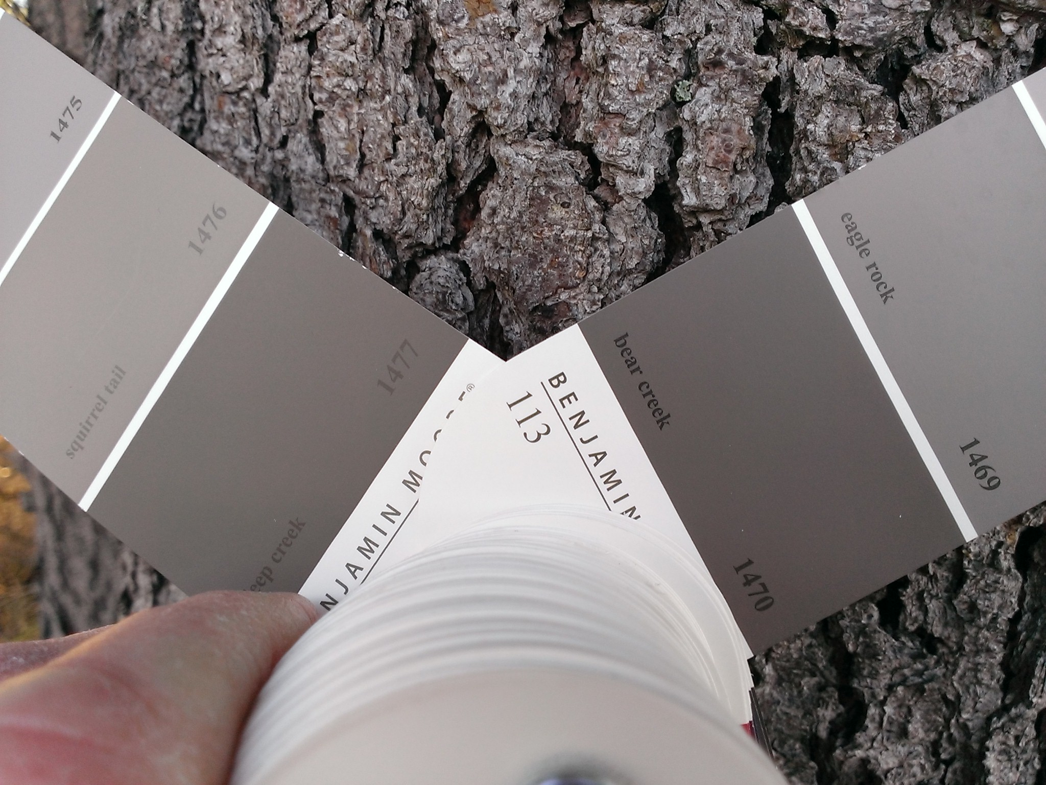
Here we are checking colors against the existing shore pine bark.  There were several on the site.  The warmer color of the beach pebbles shifted the palate a little.

Applying large swaths of several colors and comparing them to the value of the opposite shore convinced us to darken the building color.

__2_0057.JPG

Here the building blends well with the surrounding landscape. 

A Dry Climate Getaway

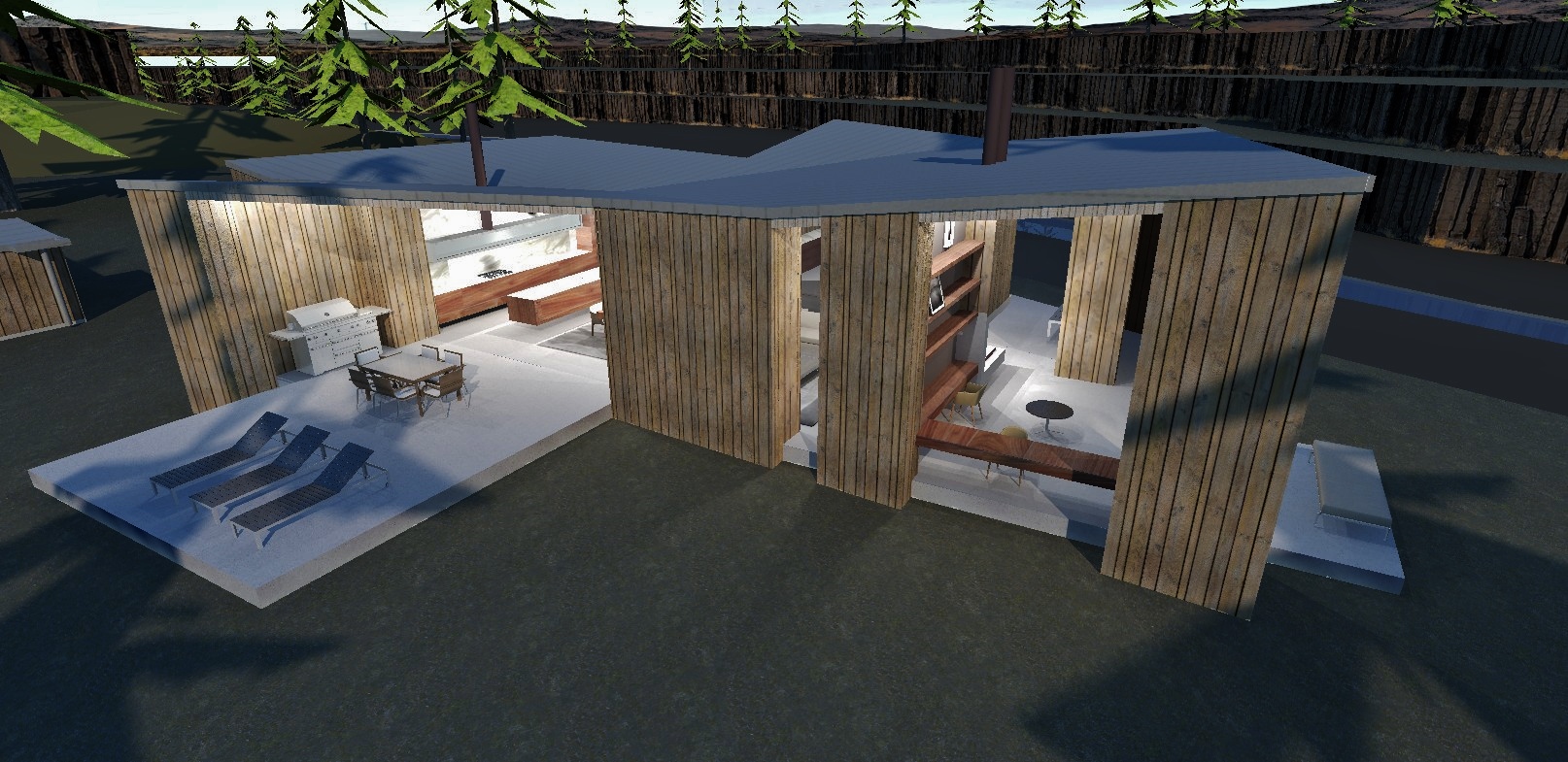
The design for this retreat in the desert country of Eastern Washington was formed to compliment the natural setting.   Large deep set windows between thick corners open up to the spectacular scenery while being shielded from the hot sun.    

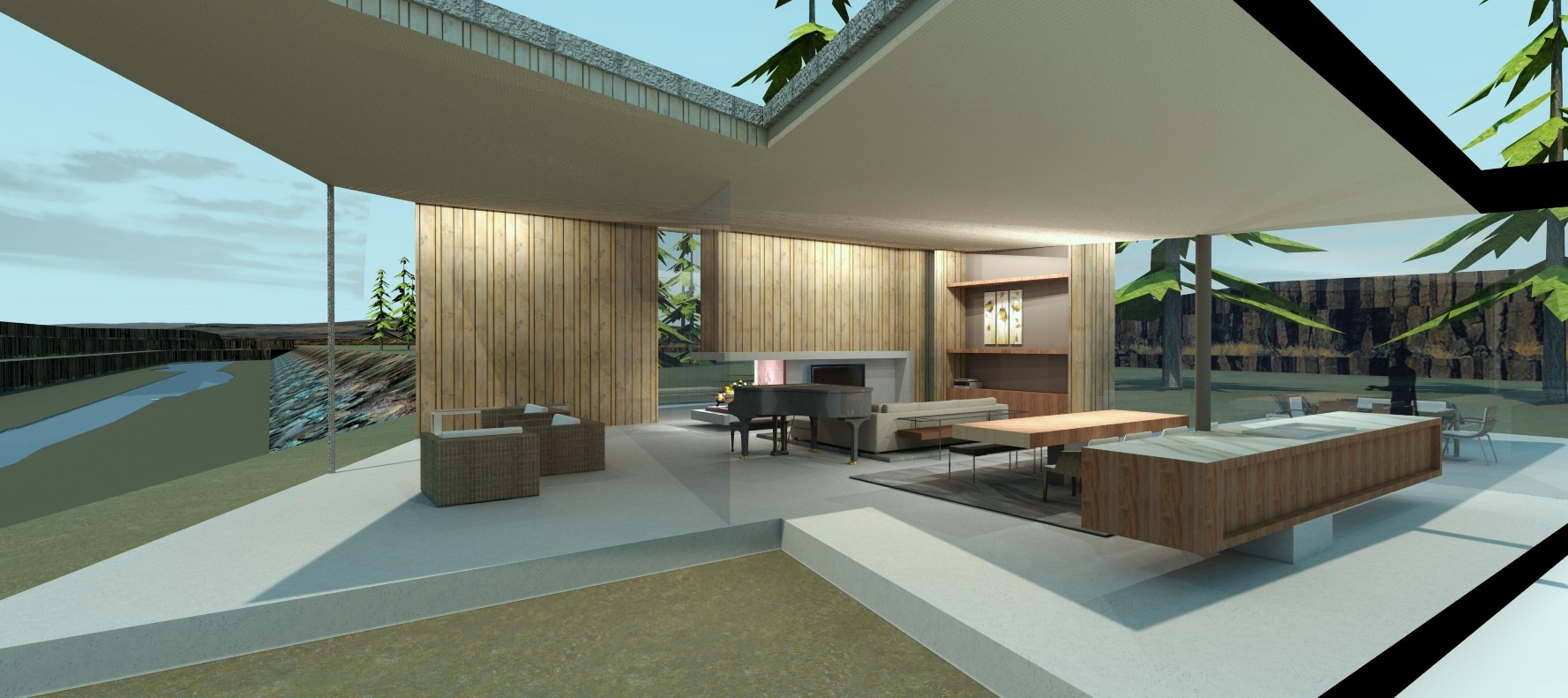
The retreats spaces are arranged to easily flow together and open out to the landscape and views.  Private spaces, bathrooms & closets,  occupy the thick protective corners.

The outdoor covered porch is shielded from the hot sun by thick sidewalls.  Heavy beetle kill pine planks are layered up to make a thick fire resistant siding. 

The shadier side of the building is more open to the landscape.  The roof is shaped to collect rainwater to a single point and funnel that to a cistern. 

Thick beetle kill pine walls are carried inside the retreat to give it a modern camp like feel. 

As the roof projects up and out the views become larger and more dramatic.

The large banks of floor to ceiling glass with the associated terraces project rooms into the landscape making the modern camp feel.

The result is a dramatically open, modern, camp like retreat in tune with the surrounding environment.

Sketch Detailing in Architecture

General sketching is a great tool for an architect.  Also, more detailed sketching becomes a wonderful tool to help move projects along.  Every custom building requires attention to how pieces come together and communicating how they work can be facilitated with sketches.

There are often questions about exactly how pieces of trim or material interactions should work.  Shown here are examples of sketch work we use to communicate specific details.  The color helps the sketches read easily for busy construction crews.

Some more complex issues can be worked out in sketch form so the contractor on site and we, the architects, can discuss various methods to achieve a pleasant result.

Changes of window manufacturers or flooring materials, etc. can lead to rethinking of details.  These changes can be communicated quickly with all the different members using colored sketches.

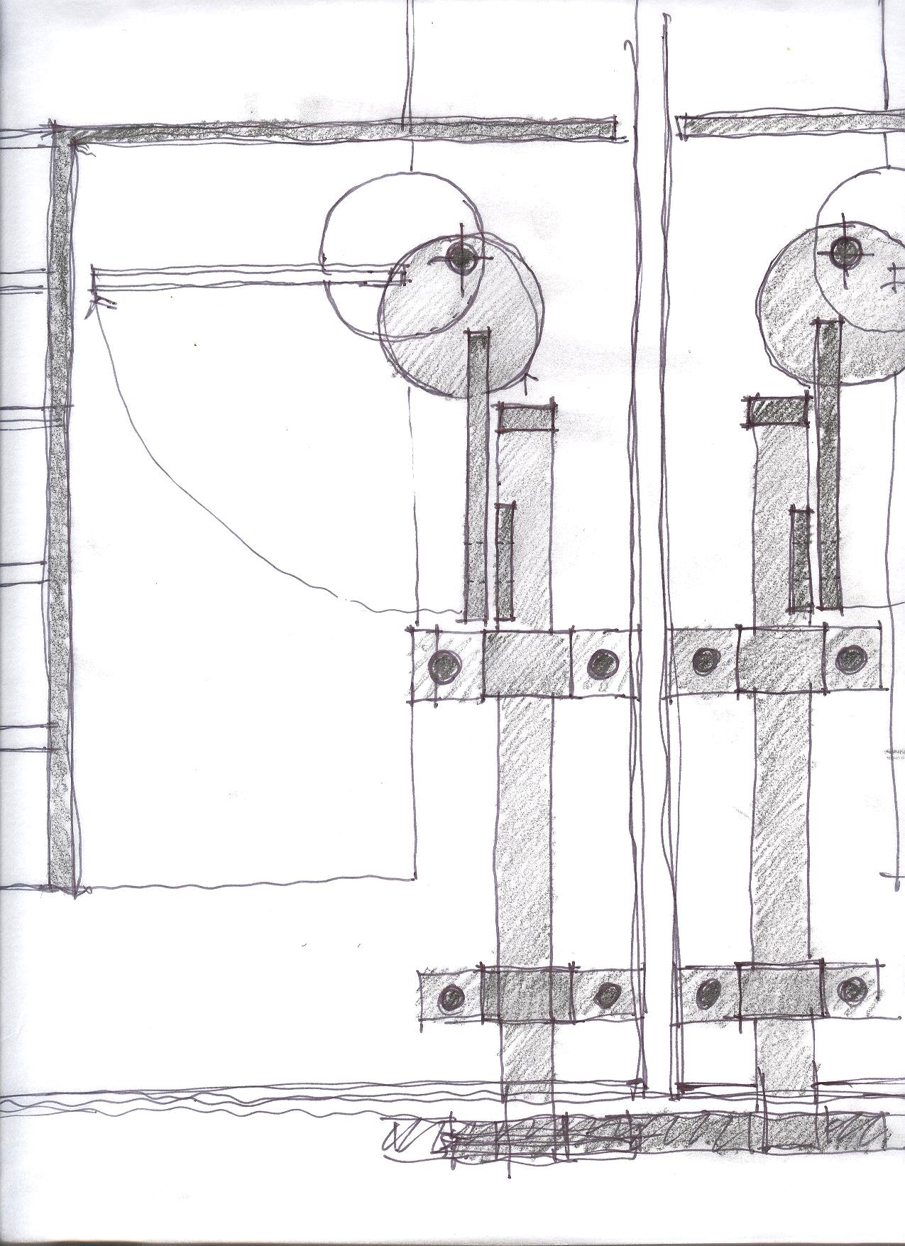
Design is also helped with sketch details.  In working out a door combined with a grill and insect netting for a home in Bangalore, several options were looked at quickly.  Above is a security grill with a two step foot bolt operation fabricated out of plain steel.

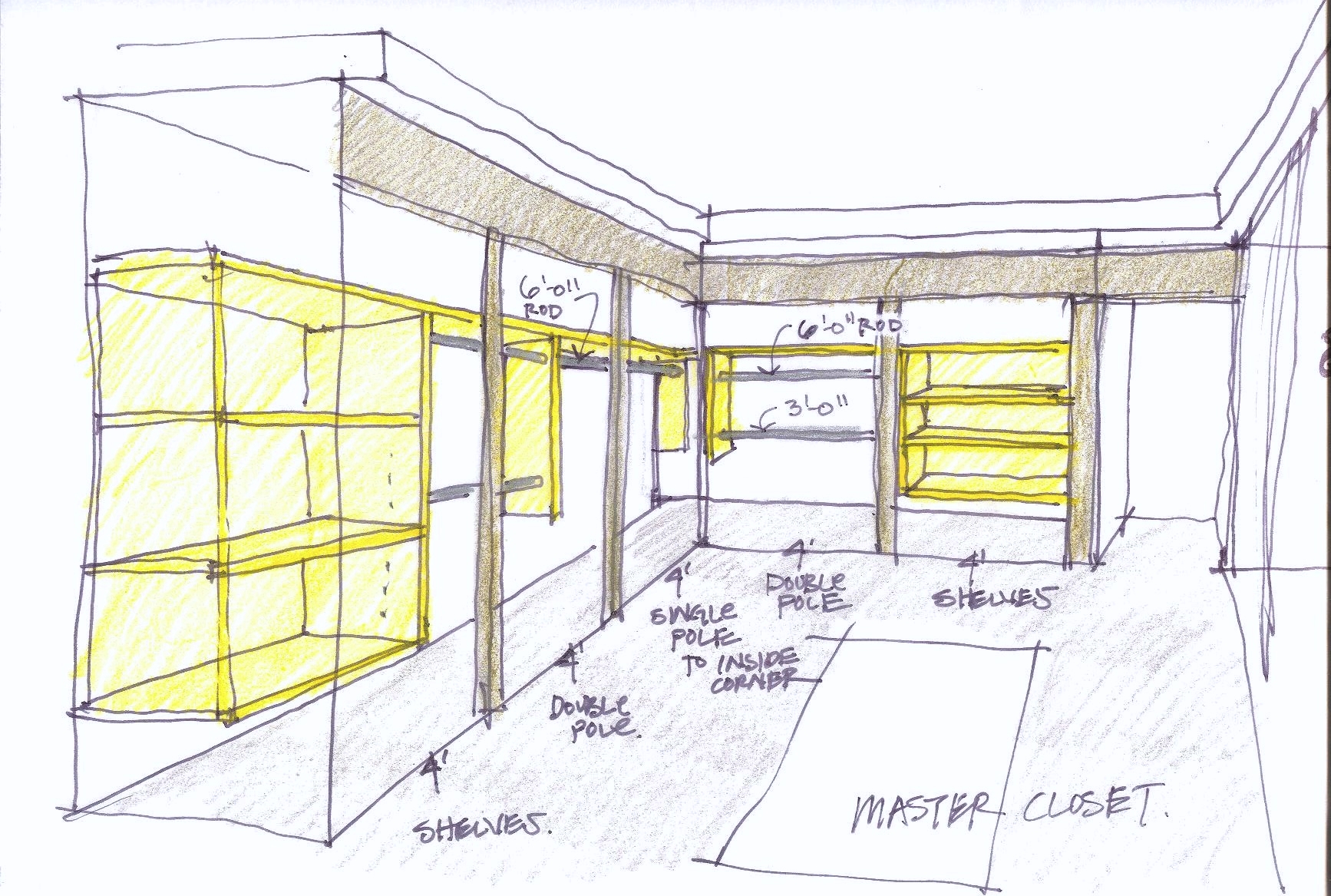
Even such mundane items as a closet build out, shelves, rods, double rods, can be communicated quickly to cabinet makers and owners.

Location of paint breaks in a complex interior are made clear with a quick sketch.  This eliminates hours of arm waving!

We enjoy making sure the contractors on projects are able to keep moving.   Sketching details and desires helps make that happen.

Making the Most of Your Land

Site planning is designing the location and layout of a new home on the site.  It is fundamental to what architects do.  For a precious lot, one the owners have decided to spend their lives on, site planning is truly important.

An existing rock outcropping and water course were fundamental for the design of this home on Orcas island.  The owners picnicked on the rock in nice weather while dreaming about their new home.  We kept that idea and formed a terrace around the rock backed the living areas up to it.  The top of the rock set the location and height of the living level of the home.  After this was established other pieces fell into place.   Bridging the water course to the bedrooms on the opposite side of the swale preserved the views to the water from the entry and the existing water course. 

SLA image

SLA image

MDS00087.jpg
SLA image

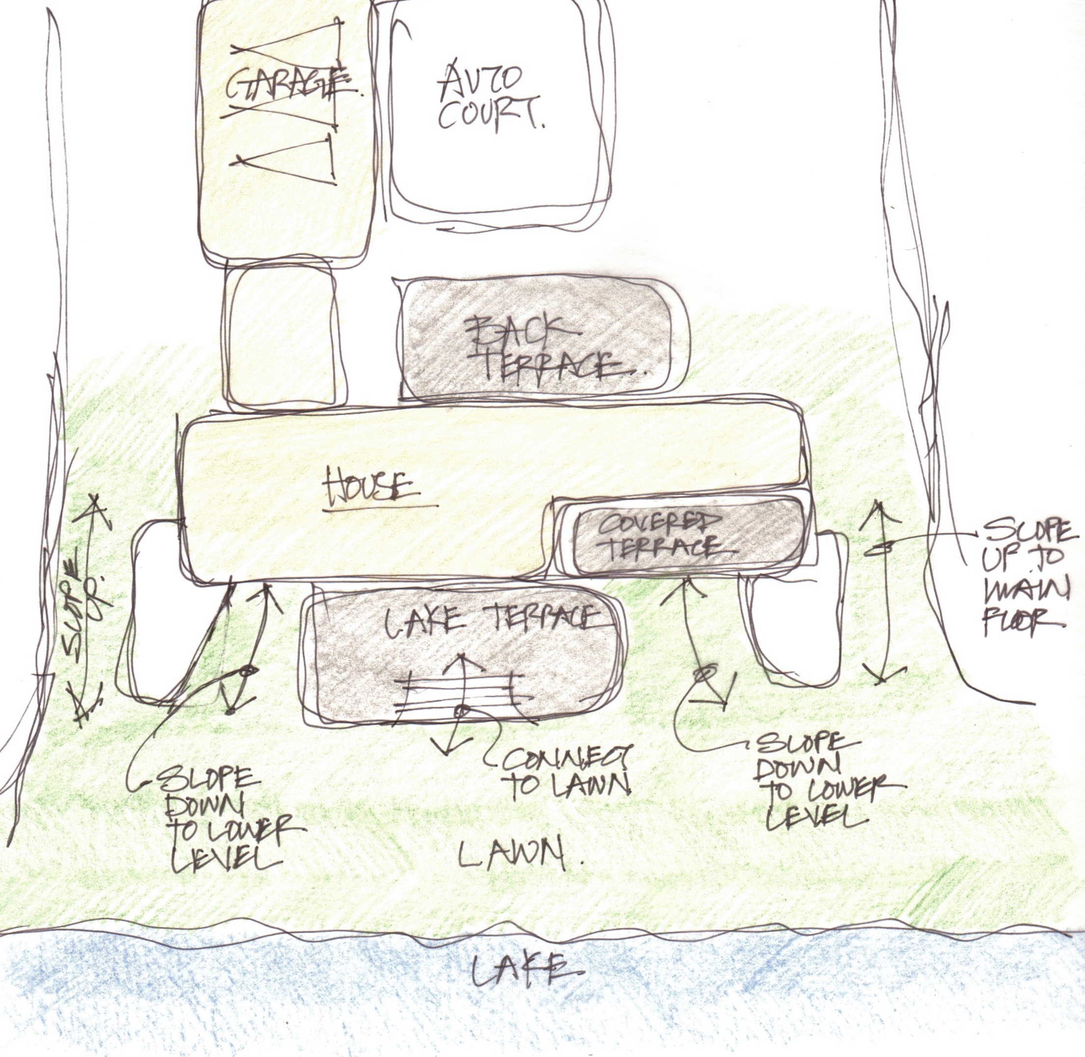
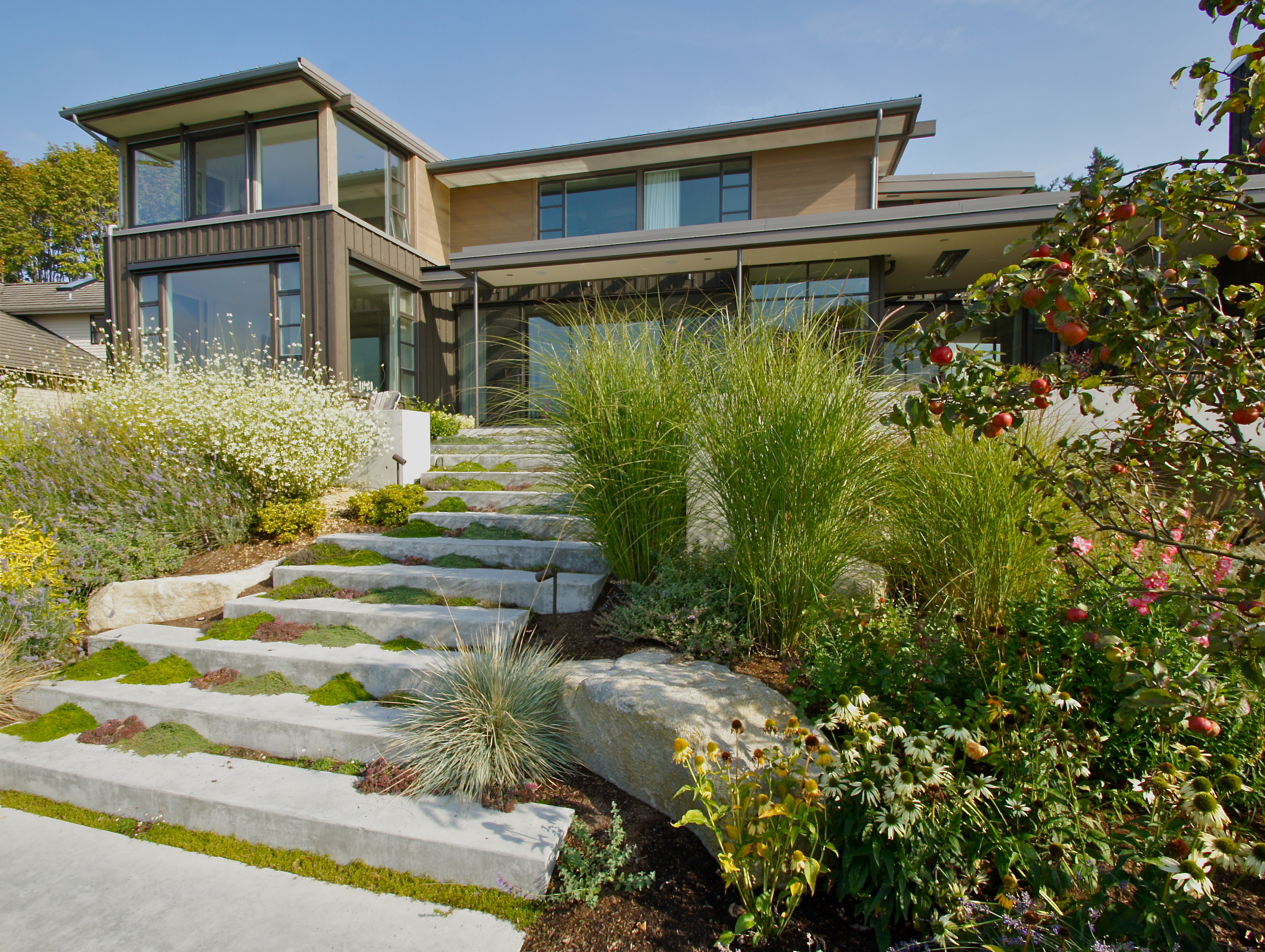
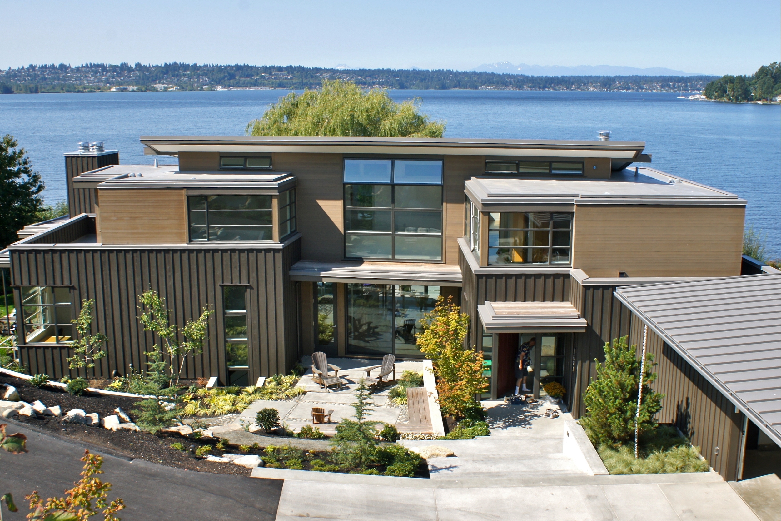
Other sites do not have these dramatic features, but still offer wonderful features or views to work with.  A recent project on Lake Washington abutted a large grassy lawn on the water.  The home was designed to allow easy connections to this wonderful feature.  The main living levels as well as the lower recreation levels were designed to link seamlessly to the lawn.

SLA image
SLA image
SLA image

SLA image

SLA image

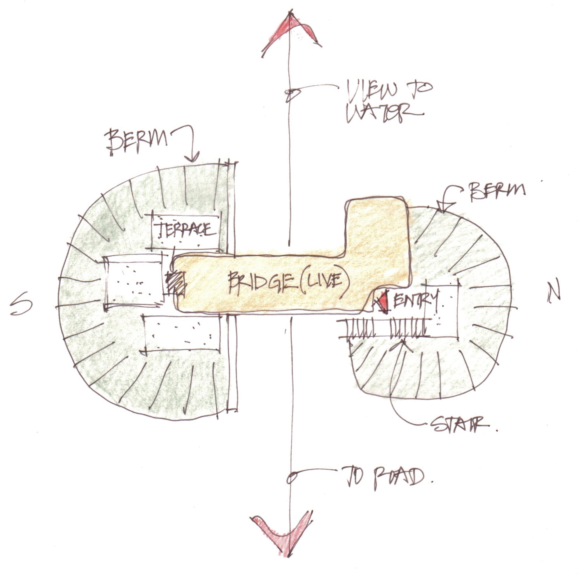
Another property was high bank waterfront which limited the view to the water from and elevated platform.  Raising the home up for a view was required, but having only a deck for outdoor space was not a pleasant way to make the most of the lot.  The approach became to berm up ground to create elevated terraces around the home.

SLA image

SLA image

SLA image

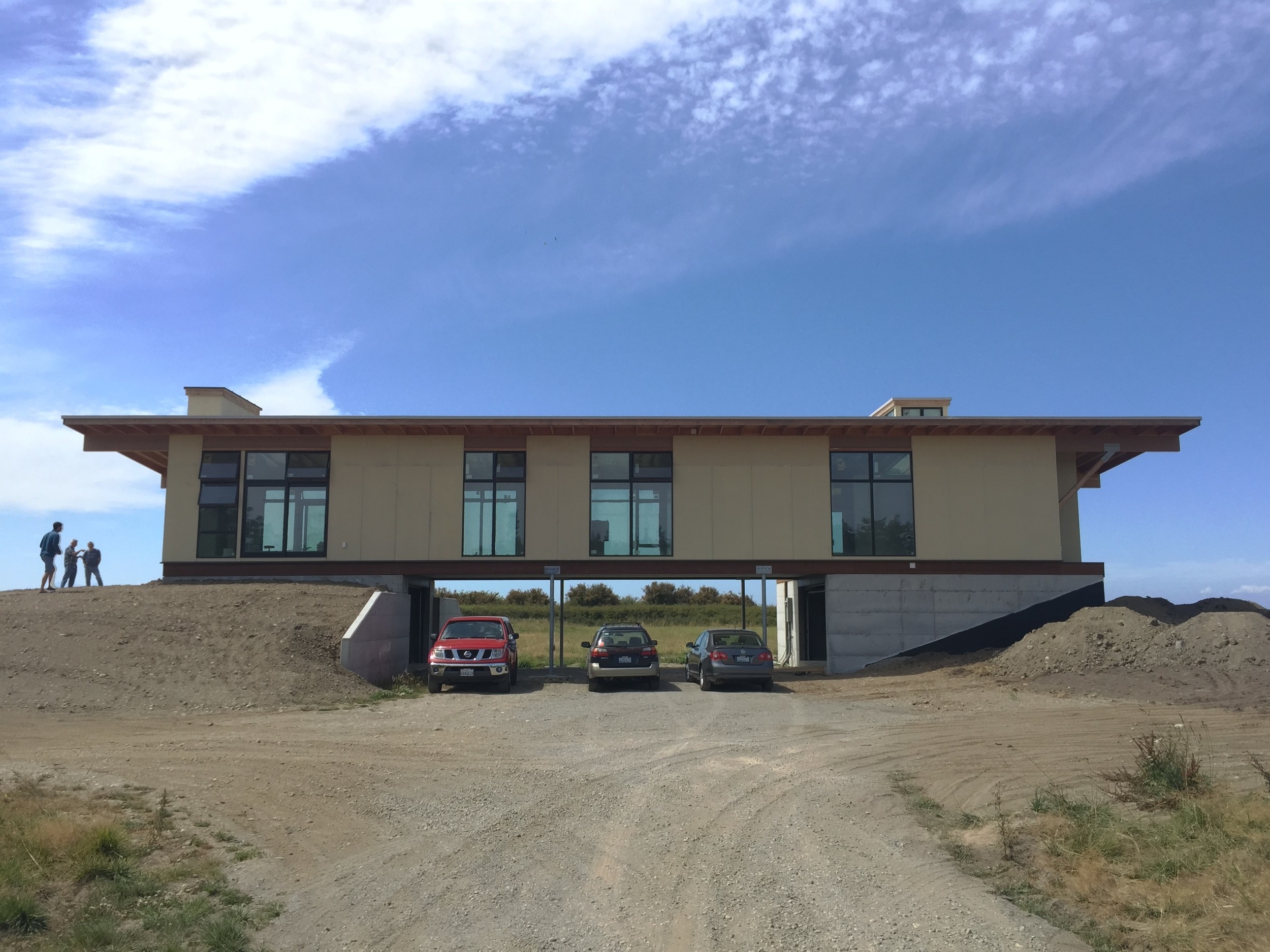
Creating a bridge heightened the experience of the land and the view under the home from the approach drive is now an added dramatic experience.

SLA image

SLA image

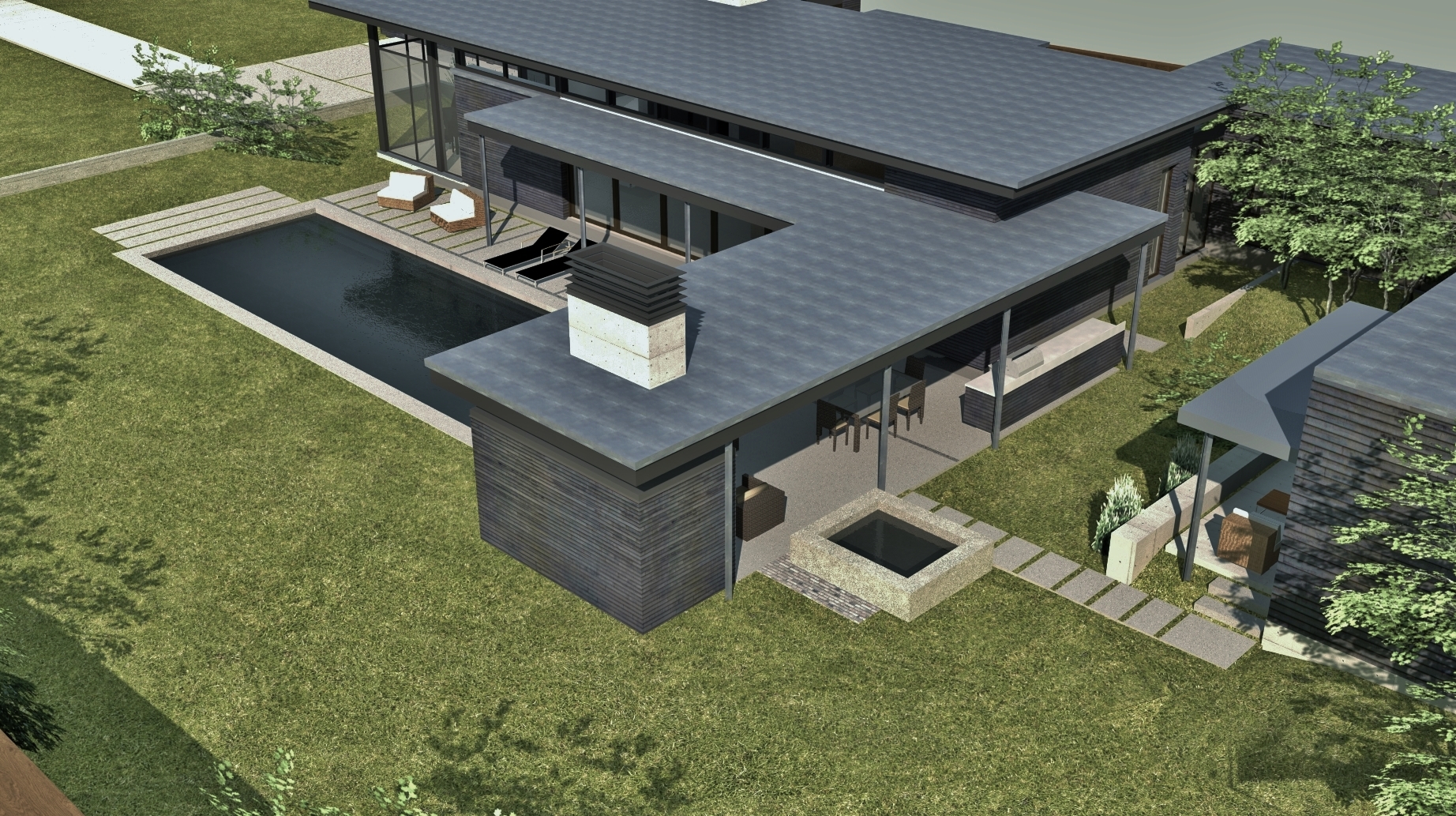
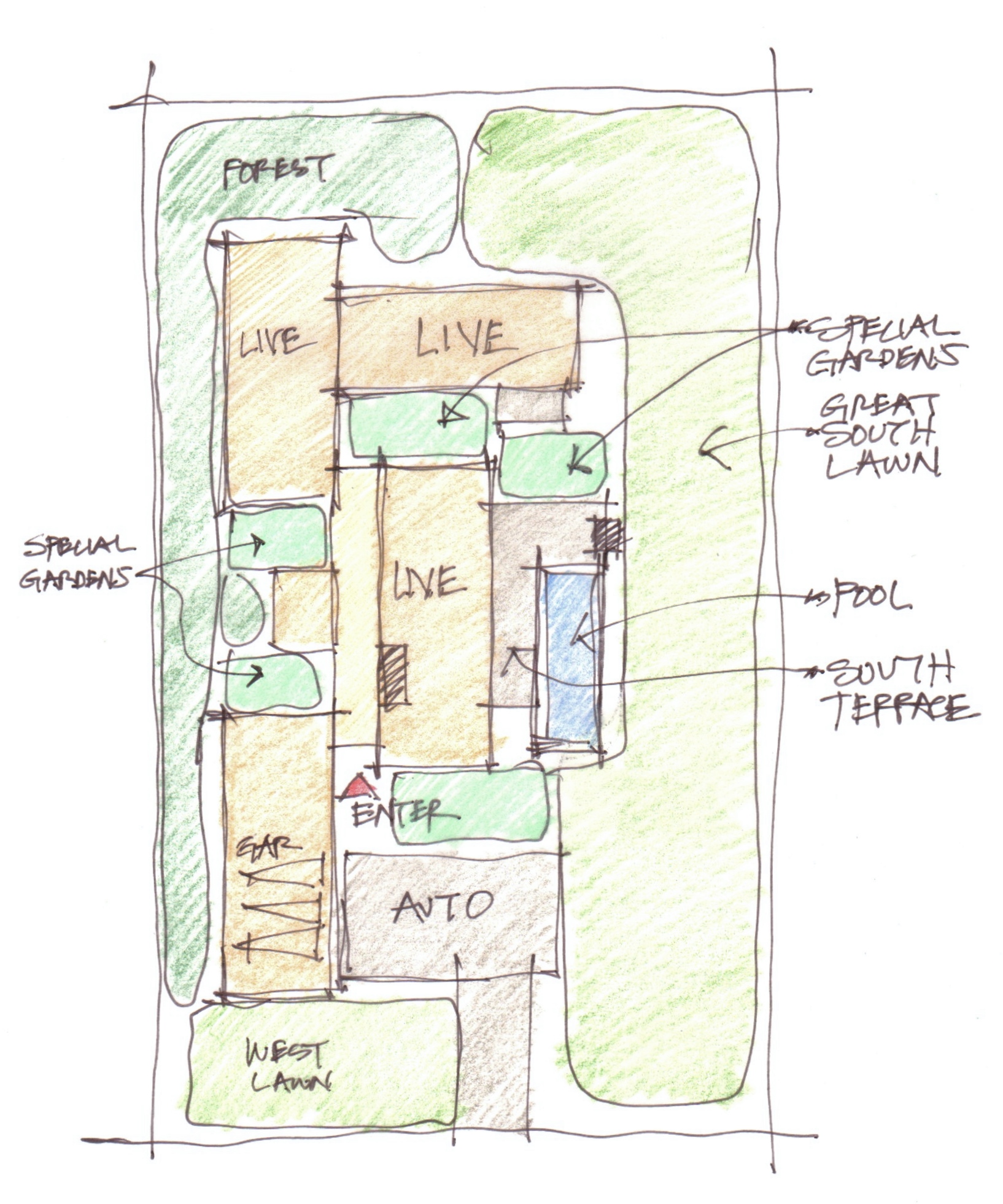
Even a flat site can be looked at to create a memorable home.  This site was flat but large enough to create a great south lawn and interrelated gardens within the home's layout.

SLA image

SLA image

SLA image

SLA image

SLA image

When planning for a new home, emphasizing the unique aspects of the site and creating an intimate relationship with the natural environments is elemental to making a beautiful home.

A mid century experience in Palm Springs

My wife and I recently checked out the mid century modern architecture in Palm Springs. Several architects and developers in the area produced wonderful designs and developments. We stayed in the Movie Colony hoteldesigned by Albert Frey.  It is a pre air conditioning design which includes upper floor sleeping porches. The plan is a delightful arrangement of overlapping floors.  A central courtyard us used for the hotel breakfast and all the guests gather there in the morning.  It is a wonderful place to stay in Palm Springs. 

SP are the upper level sleeping porches.  Bedrooms are adjacent.  Ground level living areas are below the porches and bedrooms.

SP are the upper level sleeping porches.  Bedrooms are adjacent.  Ground level living areas are below the porches and bedrooms.

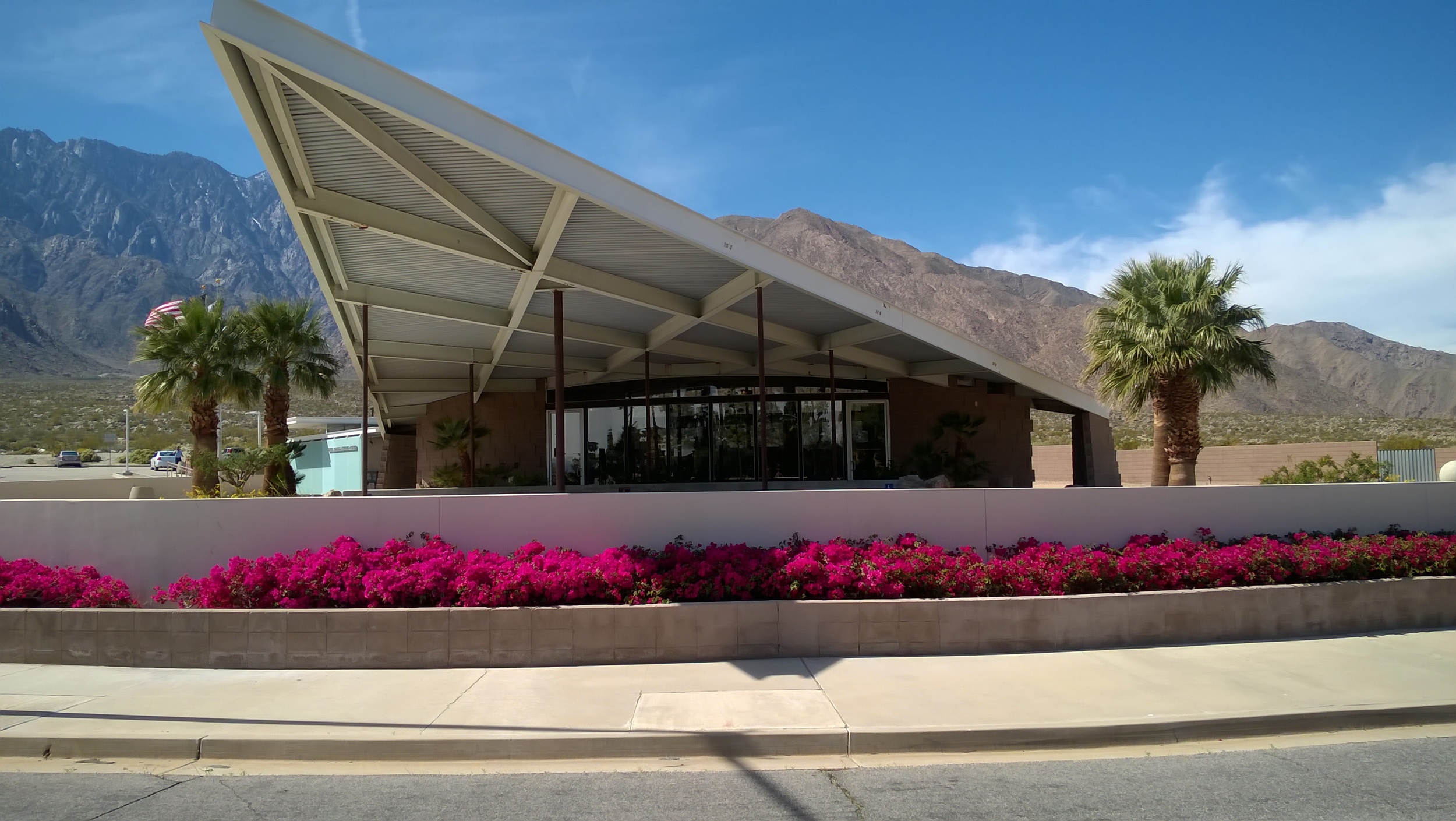
Another Albert Fry feature is the gas station turned into a visitor center.  it is a hyperbolic paraboloid roof with a wonderful proportions.

Touring around the Rancho Vista housing development by Donald Wexler.  Many of the homes have been bought recently and are being lovingly rehabilitated. 

Another Wexler project was intended to show off the unique possibilities of using steel for the structure.  One design was uniquely steel and delightful. 

Besides some great architecture there is some great hiking in the area in Joshua Tree National Park and the Indian Canyons area. 

Amazing rock formations in Joshua Tree.

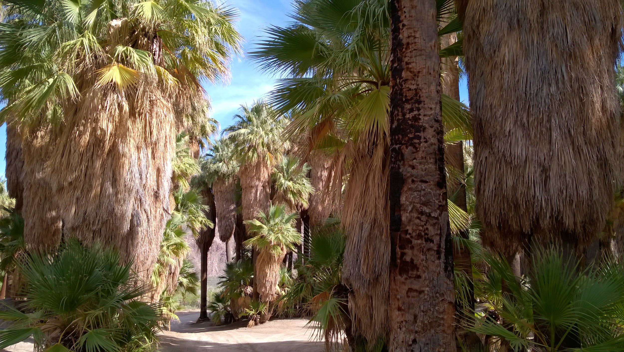
Canyons hiking among palm trees.  Notice the debris piled up against the tree trunks from flash floods.  Something to definitely avoid!

The Iconic Hyperbolic Paraboloid Roof and a Great Design

Why the Catalano House was so loved.

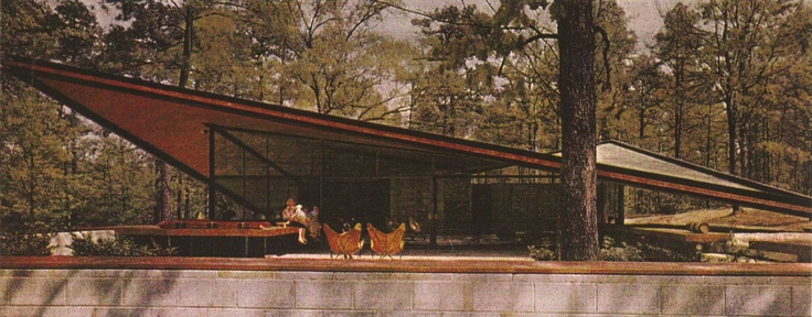
The Catalano House in Raleigh, North Carolina, by Eduardo Catalano was a marvel of midcentury design.  It is renowned for the use of a hyperbolic paraboloid roof.  But it is not the use of this unique structure that made the building wonderful.   It was the finesse with which Mr. Catalano orchestrated the separate parts of the building combined with the beautiful lines and shapes he formed with the building pieces; the roof, terrace, service spaces and landscape walls.

University of North Carolina collection

University of North Carolina collection

NCSU image library

NCSU image library

NCSU image library

NCSU image library

The Catalano house in Raleigh, North Carolina, is abeautiful building in a delightful landscape.

Take the hyperbolic paraboloid roof to start with.  It can be pushed and pulled into any proportion.  But this roof is lowered into a fine tip and a shallow saddle.  It is lovely and expressive.  It attaches to the ground with a fine tip and projects into the surrounding trees with a sharp edge. 

But Mr. Catalano did this.  A beautiful low expressive roof that projected into the landscape.

But Mr. Catalano did this.  A beautiful low expressive roof that projected into the landscape.

Underneath the roof,  Mr. Catalano could have plopped a standard square of rooms as with so many hyperbolic roofed buildings.  Instead, the floor plan of his house slides under and back out from the roof.  The terrace on one side and the car port on the other.  A block of service spaces slides through the glass wall and out to form an edge of the auto court.  The living terrace slides under the roof and through the glass wall projecting space from inside to out. 

Catalano created a plan that projected out and allowed the landscape to slide in under the roof.  It allowed the roof to become a dramatic part of the site.

Catalano created a plan that projected out and allowed the landscape to slide in under the roof.  It allowed the roof to become a dramatic part of the site.

Even in section the house is emotive.  A gentle slope drops off as the house terrace projects the terrace into the trees. 

It is the brilliant handling of proportions and the interplay of the roof, walls, and ground that make this home a wonder of midcentury modern design.  Unfortunately, it is lost and now remembered only in pictures.


Big Rocks!

SLA image

SLA image

We often place rocks in our terrace designs to end a linear movement or accentuate that same linear movement.  We place them to create a focal point or we use them to help modify a change in the slope.  Because boulders are common in the northwest, having been deposited about by rivers and glaciers, they have a nice connection to our natural environment.

Rocks uncovered from the site are often utilized in the design

Rocks uncovered from the site are often utilized in the design

Whenever possible we try to use rocks that are uncovered from the site.  But when we decide to bring rocks in we usually to go with our clients to Marenakos Rock Center near Issaquah Washington.  They have a good selection granite that we like and a spacious yard to look over. 

After planning where rocks will be set and what size of rock we would like, we select the specific rock.  Often we number them to help in the process.   Placement is important.  We like to make sure that a certain portion of the rock is visible when the final concrete is poured.  There is lots of work with transits, tape measures, and shovels to make the most of the rock.  We carefully detail location and orientation and often stay on site supervise the placement.  It is tiring but enjoyable work to help set rocks and the final result when the rocks, concrete