architecture

Design of the Prairie Home

The owners of this home purchased a sloping pie shaped lot with access from above. There are nice views of downtown Great Falls and the Missouri river to the East. Capturing these views was a priority.  Also, this open hillside lot is exposed to the prairie wind which can make decks and outdoor spaces uninviting.  Creating some protected outdoor space for the family became an added goal for the design.

The lot is wide enough to exploration layout options.  One option is to build a simple square in the center of the lot.  Another is to build a longer L shape.  Most of the homes in the area follow these models.   But they do not help create compelling or well protected outdoor spaces.  The option chosen and shown below was to split the house into a bedroom wing and living wing creating a central protected outdoor space between them.  An outdoor deck, lower level terrace and a grove of Aspen trees now occupy this protected spot.  The Aspen grove softens the deck areas and mimics the sheltered canyons in eastern Montana. 

The overall layout plan shows the entry drive from the West, the garage and bedroom wing to the North and living wing to the South with deck and lawn to the East   

The overall layout plan shows the entry drive from the West, the garage and bedroom wing to the North and living wing to the South with deck and lawn to the East   

The southern portion of the home includes a TV area, kitchen dining and living.  The northern portion the garage laundry and master suite.   A narrow circulation hall with stair connect the two wings.  The central deck is accessed fro…

The southern portion of the home includes a TV area, kitchen dining and living.  The northern portion the garage laundry and master suite.   A narrow circulation hall with stair connect the two wings.  The central deck is accessed from the Master bedroom, Living room, and hallway.

The main level deck is a central shaded and wind protected outdoor spot for the home.  The Aspen trees help provide some greenery and a bit of shade.  

The main level deck is a central shaded and wind protected outdoor spot for the home.  The Aspen trees help provide some greenery and a bit of shade.  

The deck comes to a sharp point making fun place to stand and view the river.  A lower retaining wall helps creates a manicured lawn area for play.

The deck comes to a sharp point making fun place to stand and view the river.  A lower retaining wall helps creates a manicured lawn area for play.

The lower level opens out to a terrace.  Aspen trees are planted in the beds either side of the house staircase.   A adjacent small manicured lawn extends out toward the view.  Rainwater is collected by two large cisterns.

The lower level opens out to a terrace.  Aspen trees are planted in the beds either side of the house staircase.   A adjacent small manicured lawn extends out toward the view.  Rainwater is collected by two large cisterns.

A section between the two building forms shows the connecting hallways and planting areas.  The deck and terrace are to the right.

A section between the two building forms shows the connecting hallways and planting areas.  The deck and terrace are to the right.

Low slope metal clad roofs sit atop long glulam beams.  Large gutters at the low end catch water and drop it into cisterns below.  

Low slope metal clad roofs sit atop long glulam beams.  Large gutters at the low end catch water and drop it into cisterns below.  

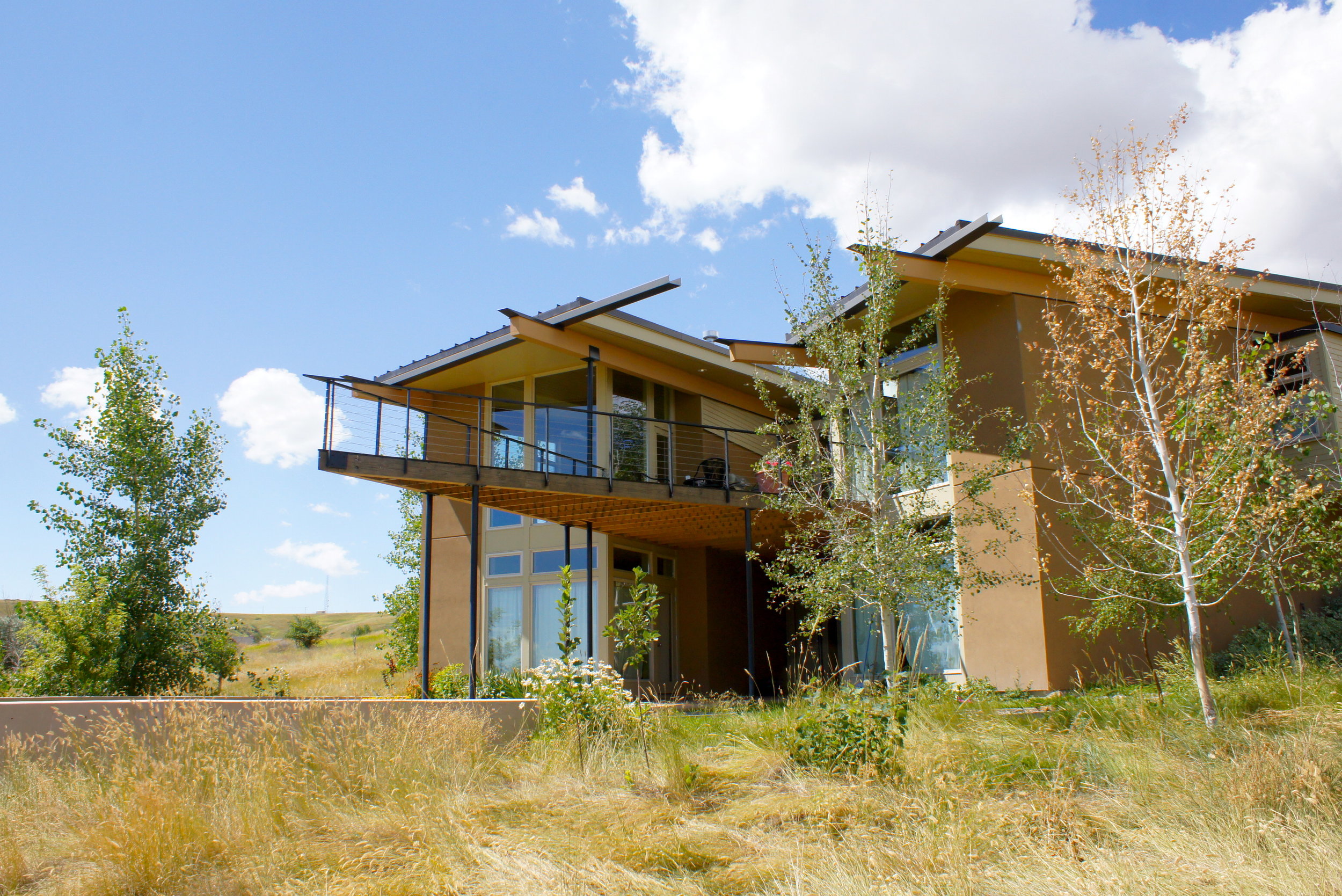
Large windows face the view downslope.   Large beams and dramatic roofs give the home some design power.

Large windows face the view downslope.   Large beams and dramatic roofs give the home some design power.

Colors of the home are intended to blend with the dry prairie grasslands while the forms provide a powerful presence.

Colors of the home are intended to blend with the dry prairie grasslands while the forms provide a powerful presence.

Projecting roofs, deck and beams are dramatic.  The sharp point of the deck is always a topic of conversation.  

Projecting roofs, deck and beams are dramatic.  The sharp point of the deck is always a topic of conversation.  

The home works well with the site, provides wonderful views to the river, and fits nicely with the local environment.  At the same time it has a strong presence. The central outdoor space becomes the heart of the home during the spring summer and fall with barbecue, chairs, table and benches.  The coppery color of the exterior blends well with the dry summer grasses.

Some Beautifully Proportioned Homes

My wife and I ran across some beautifully proportioned homes in Missoula, Montana recently.  They were such a pleasure to see and made our walk more rewarding.  The architects and builders of these homes spent extra effort making sure everything looked just right.  Proportioning the walls to the windows to the doors to the roof is a process of refinement.  And these were well refined!

The current owners have kept them looking beautiful.  Their landscaping sets them off beautifully.

WP_20160605_014 (2).jpg

It is a delight to see some of these wonderful places when out for a walk.  Here is hoping for great architecture everywhere!

Exterior Color Selection

Building exteriors are important not only to you personally but for the larger community.  Some consistency in building colors makes for a more cohesive place.  Santorini is a beautiful town marked by its whitewashed buildings.  The common use of the whitewash helps create cohesiveness as well as keeping the buildings cooler.

chad baily

In Paris there is a sense of consistency with the warm ochre of the buildings along the street.  The color makes the place more uniform and cohesive.

Here in the northwest we often have a backdrop of dark forest.  We have become advocates for somewhat darker colors for buildings to help blend with the forest backdrop especially if the building is around a treed area.    


When selecting colors, we try to work with what colors are nearby. 

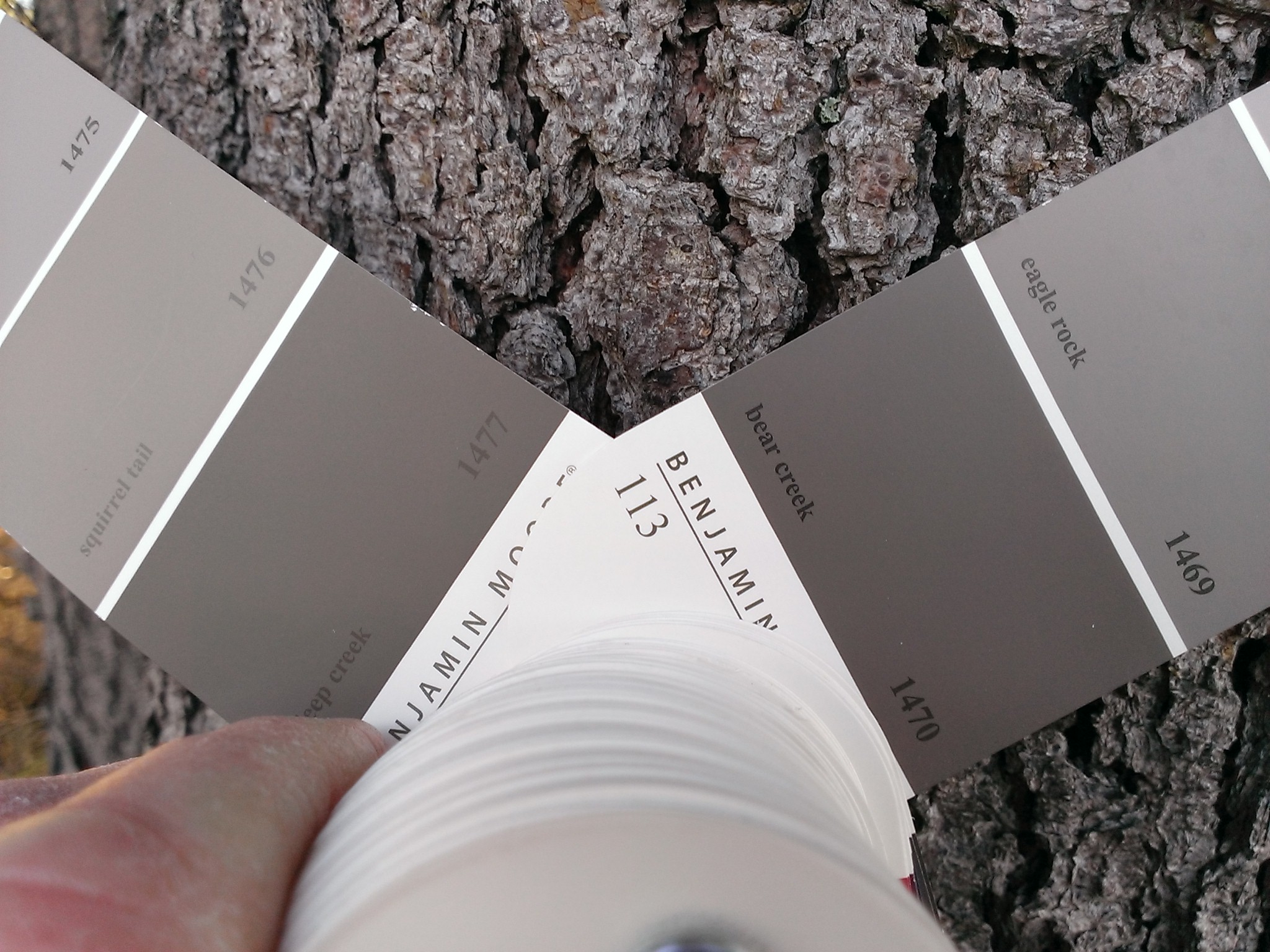
Here we are checking colors against the existing shore pine bark.  There were several on the site.  The warmer color of the beach pebbles shifted the palate a little.

Applying large swaths of several colors and comparing them to the value of the opposite shore convinced us to darken the building color.

__2_0057.JPG

Here the building blends well with the surrounding landscape. 

The Iconic Hyperbolic Paraboloid Roof and a Great Design

Why the Catalano House was so loved.

The Catalano House in Raleigh, North Carolina, by Eduardo Catalano was a marvel of midcentury design.  It is renowned for the use of a hyperbolic paraboloid roof.  But it is not the use of this unique structure that made the building wonderful.   It was the finesse with which Mr. Catalano orchestrated the separate parts of the building combined with the beautiful lines and shapes he formed with the building pieces; the roof, terrace, service spaces and landscape walls.

University of North Carolina collection

University of North Carolina collection

NCSU image library

NCSU image library

NCSU image library

NCSU image library

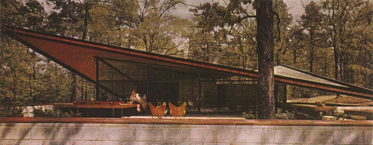
The Catalano house in Raleigh, North Carolina, is abeautiful building in a delightful landscape.

Take the hyperbolic paraboloid roof to start with.  It can be pushed and pulled into any proportion.  But this roof is lowered into a fine tip and a shallow saddle.  It is lovely and expressive.  It attaches to the ground with a fine tip and projects into the surrounding trees with a sharp edge. 

But Mr. Catalano did this.  A beautiful low expressive roof that projected into the landscape.

But Mr. Catalano did this.  A beautiful low expressive roof that projected into the landscape.

Underneath the roof,  Mr. Catalano could have plopped a standard square of rooms as with so many hyperbolic roofed buildings.  Instead, the floor plan of his house slides under and back out from the roof.  The terrace on one side and the car port on the other.  A block of service spaces slides through the glass wall and out to form an edge of the auto court.  The living terrace slides under the roof and through the glass wall projecting space from inside to out. 

Catalano created a plan that projected out and allowed the landscape to slide in under the roof.  It allowed the roof to become a dramatic part of the site.

Catalano created a plan that projected out and allowed the landscape to slide in under the roof.  It allowed the roof to become a dramatic part of the site.

Even in section the house is emotive.  A gentle slope drops off as the house terrace projects the terrace into the trees. 

It is the brilliant handling of proportions and the interplay of the roof, walls, and ground that make this home a wonder of midcentury modern design.  Unfortunately, it is lost and now remembered only in pictures.