A frame cabins in the west.
New Tile Patterns and Sizes!
We have been looking for new tile selections for various projects. These from Surface Art in Seattle and Pental caught our eye. The tile manufacturers are creating some wonderful new products. The patterns are great, the colors are sophisticated and they come in very large format.
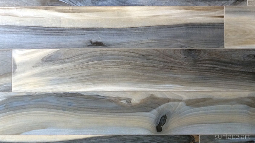
Seattle Surface Art tile: New Zealand Plank. We will try using this for our entry hall at the North Idaho cabin project.

This Surface Art tile, Sediments will be used at our Anacortes project. It will look great!

A darker version of the Sediments tile. This one is great. We are surrounding a fireplace with this tile.
Some, like the WOW tile from Pental are show stoppers. We are excited to be using these in our projects.

This is a wonderful Pental accent tile called WOW. No location yet on a project but we are excited for the possibilities.
We will post photos of the finished installations when they are done!
Exterior Color Selection
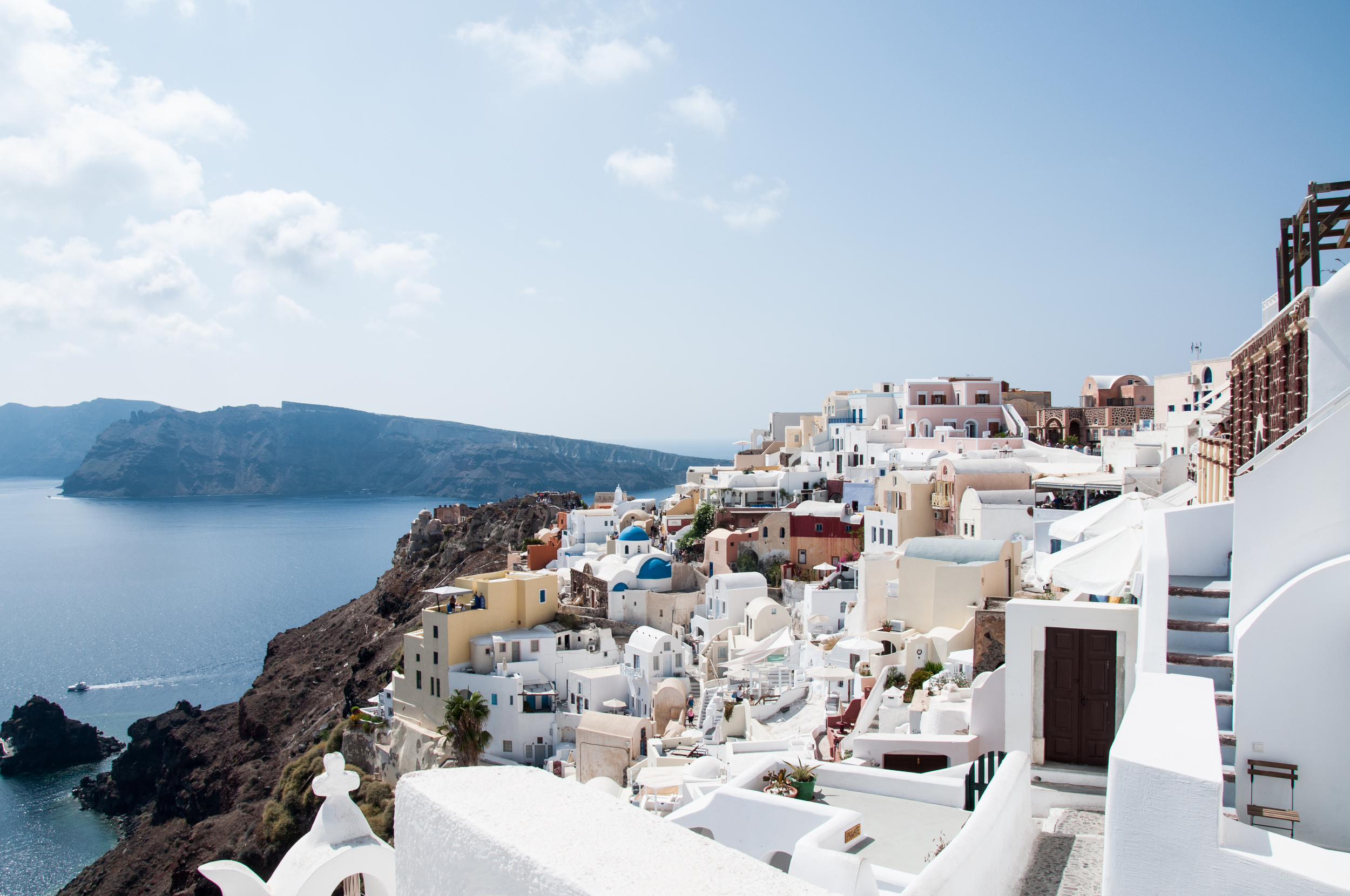
Building exteriors are important not only to you personally but for the larger community. Some consistency in building colors makes for a more cohesive place. Santorini is a beautiful town marked by its whitewashed buildings. The common use of the whitewash helps create cohesiveness as well as keeping the buildings cooler.

In Paris there is a sense of consistency with the warm ochre of the buildings along the street. The color makes the place more uniform and cohesive.

Here in the northwest we often have a backdrop of dark forest. We have become advocates for somewhat darker colors for buildings to help blend with the forest backdrop especially if the building is around a treed area.

When selecting colors, we try to work with what colors are nearby.

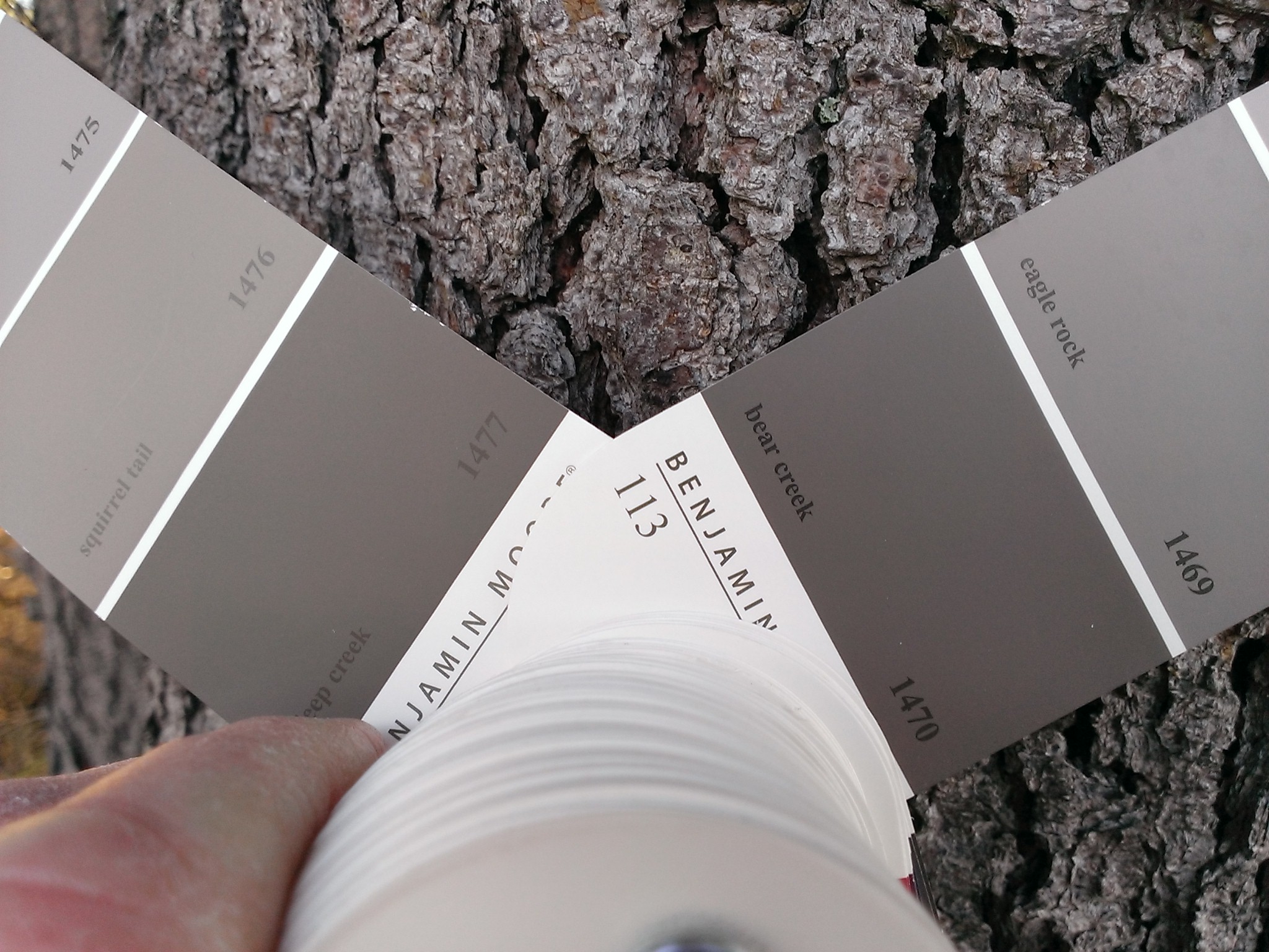
Here we are checking colors against the existing shore pine bark. There were several on the site. The warmer color of the beach pebbles shifted the palate a little.

Applying large swaths of several colors and comparing them to the value of the opposite shore convinced us to darken the building color.

Here the building blends well with the surrounding landscape.